Helping KidsCan Create Clarity Through Simplicity
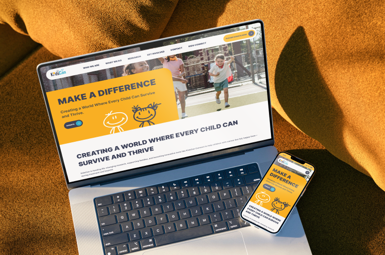
Why Less Means More To This Children’s Charity
Even with the best intentions, too many ideas can lead to unnecessary complexity. Especially for websites, which often become little more than a hodgepodge of everybody’s suggestions. You know how it goes. When Kids Can came to Dock for support, one thing quickly became clear: they didn’t need a big website. They needed a simpler one.
Building Around Reality
KidsCan Children’s Cancer Research is a Salford-based charity that funds and manages research into new and improved treatments for children with cancer.
Recently, the organisation became part of North West Cancer Research (NWCR).
When Becky, who we knew from her time at Baltic Creative, secured a new role at KidsCan, she contacted us for help with a brand and website refresh.
Knowing that KidsCan is a small, volunteer-driven charity with limited resources, we offered to design something that reflected this reality.
We met the team at Liverpool Science Park, talked through the options over coffee, and agreed on a solution that would meet their needs without stretching the budget.


Less Is More
Lke many smaller charities, Kids Can is largely volunteer and trustee-led. With that in mind, their website needed to be simple, straightforward to use, and easy to engage with.
Our lean, sensible quote was readily accepted by KidsCan.
The first job was to evolve the brand. We brought NWCR’s colours into the KidsCan logo to make it more contemporary and aligned with the wider organisation.
Next, it was time to design the website.
Webflow, an entry-level, user-friendly platform, was ideal for the job. We quickly set up the site, created an easy-to-manage flow, and configured it to suit KidCans' needs.
Our primary task was reducing content bloat and thankfully, NWCR were keen to get rid of much of the existing content. They joined us for a mini workshop, where we reviewed the site page by page.
The process took a few hours, but by the end, we’d reduced the content by 60-70%.
Armed with a (much smaller) list of the remaining pages, it was relatively straightforward to structure the new site map around what actually mattered.
Visitors to a charity website are usually looking for ways to make donations or support the cause. We use that to anchor the design and keep it really simple for people.
Now, KidsCan is able to see the vision clearly.
A Platform That Works
The new website gives Kids Can both a strong digital presence and a platform for growth. Not only in the commercial sense, but also growth in awareness, donations, and participation.
Ultimately, the site is a hub. Whenever they post on social media, run paid ads, or attend an event, everything should link back to the website.
Driving traffic is what investing in a website that converts is all about.
Of course, we could have built something bigger. But the challenge here was building something manageable for the small but mighty KidsCan team.
There’s little value in creating a complex website if nobody has the time or resources to maintain it.
Instead, KidsCan now has a platform that fits its team, its budget, and its ambitions.
They can take control of the vision and make sure the message is clear: get behind the invaluable work we do to fund and manage research to support children with cancer.
There’s no stronger message than that.
.jpg)
See our other projects
(1).png)